
Published: 7 December, 2021
- Share
-

-

-

What is a heat map?
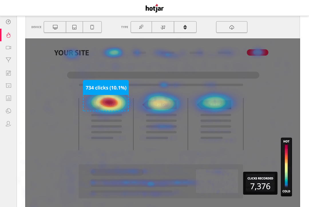
A heat map is a visual representation of how visitors interact with a web page. The data heat maps provide are displayed using a color-coded system to indicate portions of the map that are highly viewed or least viewed (red is hot indicating lots of views, blue is cold indicating low views). The type of data that can be collected and displayed ranges from mouse-movement, clicks, attention, and scroll. This tool allows us to capture and quantify what people are doing when they are on your website and how they interact with it.
7 Tips and tricks to make the most out of heat maps
With the power of heat mapping data at our fingertips, how can we improve the performance of website pages to make sure visitors are doing what we want them to do on a page? Here are our top 7 tips.
-
Gauge the Effectiveness of Your Page Layout
Your call to action is only as good as the number of people who see it or engage with it.
With the help of heat maps, you’ll be able to have insight on which content on your page attracts the most attention or receives a lack of attention from your audience. You’ll be able to see where your audience is clicking, looking, and engaging with.
Page Scanning: F-Shaped Eye Tracking
We tend to scan a page in an F pattern, reading headlines, subheadings and bullet points, but largely ignoring the right hand content (source studies). While generally true, this is not a universal truth. Checking to see if your page follows this format, and if your audience scans the page in this way, is important to ensuring your page is easy to consume.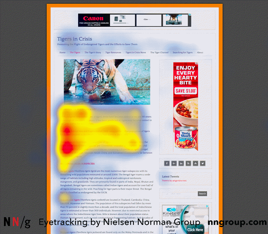
-
Distinguish What Users Can (and Can’t) Engage With
When it comes to page interactions, you will want to make sure that any clickable elements on your webpage are clear to your audience. Use heatmaps to identify if there are any clickable areas that people never even try to click on, and if there are any non-interactive areas that people click on a lot. If you notice this disconnect in expected interactivity, you may need to revise the design of your page. -
Ensure that Key Info is Above the Fold
Google Analytics will tell you the screen sizes of your visitors, but it’s another thing entirely to see what your visitors see. Often, you’ll be really surprised by what is or is not above the fold of your website page. You’ll also find it insightful to see how many users scroll beyond the initial page to read more info or just take a look at what’s displayed without any navigation. The information displayed above the fold is key, you’ll want to share your most important content and call to actions there to be sure your audience is receiving the most essential messaging you want them to receive. -
Are Your Visuals Effective?
When it comes to attracting more attention on your website, utilizing visuals will go a long way. Consider using heat maps as a way to test out if visuals integrated on your website are drawing attention or not. If you notice users aren’t interacting with your site, use A/B testing to see how new visuals can change that dynamic and how your website’s heat map may change. -
Signs Your Page Content Sucks
With heat map tools you’ll be able to easily see where your audience navigates. Are they often scrolling to the bottom of the page, back up, and back down again? They clearly expect to find something on this page but aren’t. Clicking nav options for the pages they're already on is another indicator that your page either doesn’t have the information that someone is expecting to see.
Heat maps can give you some of this data but screen recordings are the real gem when it comes to identifying if your page is missing key content. -
Engagement Discrepancies by Device
Heat maps allow you to move past the basic reporting in Google Analytics to identify not only IF your visitors behave differently on mobile and desktop, but WHY they behave differently. Reviewing heatmaps for scrolling and click patterns on both devices will give you a better understanding of what your audience’s experience is like. -
Dig Deeper: Use Real-Time Surveys
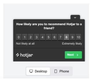
Some heat mapping tools have user surveys that you can leverage to get first-person feedback from your audience, reducing the assumptions that you make about their behavior. Questions can be simple and straightforward, “did you find what you were looking for today?”, or more open-ended and qualitative, “tell us about your experience with our website”.
When you collect data from several sources (heat maps & surveys) you can create a more comprehensive picture of your user experience and interactions on your website.
Test, Measure, Report, Repeat
Collecting data is great -- but most people stop there and fail to review, interpret, and act upon the data. If you want to take your conversion rate optimization to the next level and have your site really perform it’s best, contact us for marketing intelligence services.

Other posts you may be interested in

How to Use the HubSpot AEO Tools to Grow Your Visibility in AI Search
.png)
Is SEO Dead? Organic Growth in the Age of Zero-Click and AI Overviews

27 Biggest E-Commerce Mistakes (and How to Fix Them)

.png)
.png)