Published: 17 March, 2025
- Share
-

-

-

Getting the right image, in the right size and format, in the right spot on your webpage is crucial for great web design and a solid end-user experience. We’ve put together the Ultimate Website Image Sizing Guide based on our most commonly asked questions.
Table of Contents
- Ratios & Images
- Favicons, Logos & Template Images
- Hero Images & Full-Width Images
- Images for Blog Posts & Content Pages
- Image Size & Page Load Time (Important for SEO)
- Image File Types
- Image Names & Alt Tags
- Video & GIF Sizes
- Embedding vs Hosting Videos
- Color Profiles
- Other Considerations
Ratios & Images
There are different recommendations as to which dimensions you should use for website images, so before you get into a debate about pixels we should come to an agreement on ratios. Identifying the image shape for each section of your site (which ratios should be in play) is a critical first step.
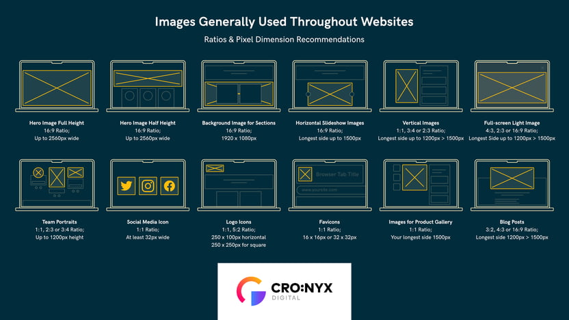
Common Aspect Ratios
- 1:1 Square. Most commonly sized 1080 x 1080px, square images are great for in-text images, sidebar ads, and Instagram.
- 16:9 Panoramic. This is your common website Hero image ratio for standard widescreen sizes. It’s often sized 1920 x 1080px and is used in presentations, widescreen TVs, and landscape images.
- 3:2 Rectangle. Often used in print or on phones, sized 1080 x 720px.
- 4:3 Rectangle. Slightly taller than the 3:2, the 4:3 rectangle was the most common ratio for screen sizes before widescreen monitors became popular. This ratio is typically used in 640 x 480px images for smaller screen sizes or placements, or could be up to 2048 x 1536px for full-screen takeovers.
- 1.59:1 Landscape Ratio. Typically used and supported throughout different social media platforms, landscape ratios are also popular for ‘featured images’ for blog posts and other content. Recommended minimum of 1080 px in width.
Favicons, Logos & Template Images
Favicons
Favicons are the little icons found in your browser tab, in your bookmarks, and in the Google Search results. They’re not used in many places but they’re still important to have on your site.
Favicon files should be .ico or .png and should be a 1:1 ratio (square) with a minimum size of 16x16 px up to 32x32 px.

To convert a png to a ico file you can use tools like favicon.io.
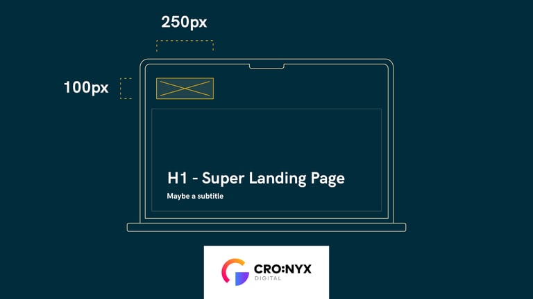
Logos in the Navigation Bar
If you’re using your site's logo in the top nav bar we recommend your logo image size to be:
- Horizontal Logos: ratio of 3:2 or 250 x 100px
- Square Logos: ratio of 1:1 or 160 x 160px
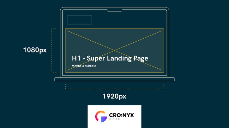
Hero Images & Full-Width Image Sizes
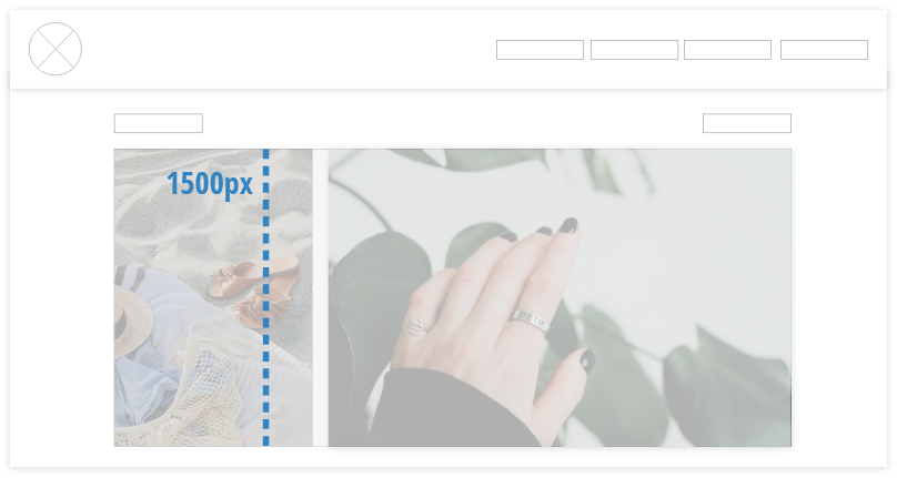
Your hero image will likely be a ratio of 16:9 if you intend on using the entire height of the browser. In this ratio, your image width will likely range from 1500px (absolute minimum) to 2560px (maximum recommended). We recommend going with 1920px wide as it is the most common browser width in North America.
What are the most common screen resolutions?
According to StatCounter, as of April 2022 to May 2023 the most common desktop screen resolutions worldwide are:
- 1920 x 1080: 19.85%
- 1366 x 768: 14.33%
- 1536 x 864: 9.44%
- 1280 x 720: 6.52%
- 1440 x 900: 5.92%
- 1600 x 900: 2.27%
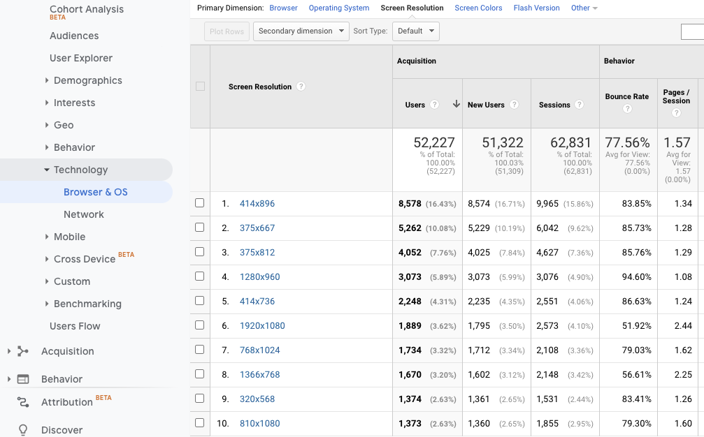
Note that even the most common browser size is still not even 20% of the market share. It can be incredibly insightful to check your Google Analytics Screen Resolution Report to see what the most common screen sizes are for your particular audience. In the example below we see that by far, visitors are consuming this website's content on small, mobile devices (notably not included in the 'desktop view' stats above).
Audience > Technology > Browser & OS > Screen Resolution
File Size Matters
While ‘bigger is better’ when it comes to ensuring a high-resolution experience, bigger is NOT better when you take page load time into consideration. As page load time is a key factor in Google’s Core Web Vitals algorithm, you’ll want to make sure that your largest image file size is no greater than 20 MB.
If you’ve got plans to put more than one image on your webpage, each image file size will add on to the total page size. Large file sizes, and multiple files, will affect site performance and page loading times.
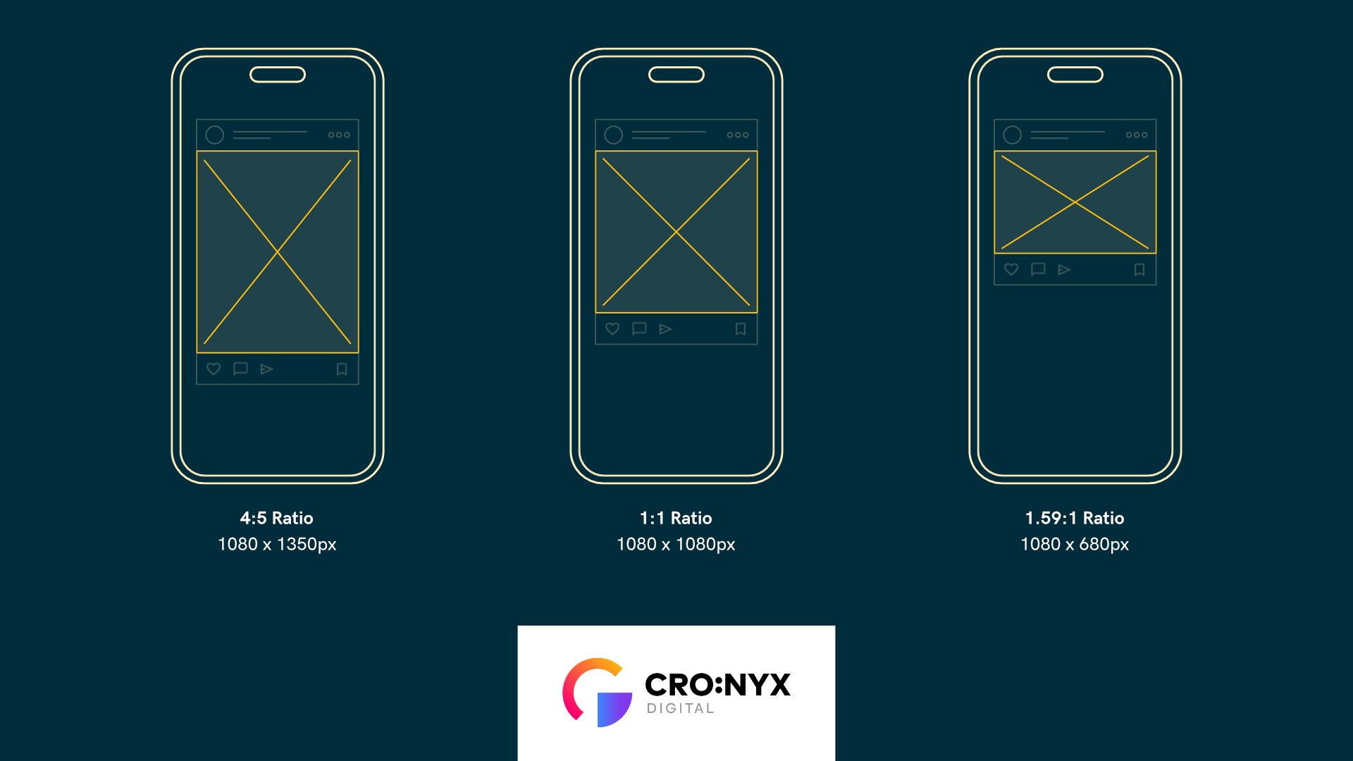
Hero Image Sizes for Mobile
Most responsive websites will resize your hero images to fit the device that they’re shown on. However, if you have very large images or are using videos in your hero sections you may want to specify alternate images to show when someone is visiting the site on a smaller screen. This can help with page load time on devices that are using data vs wifi and can also help save some bandwidth and data usage for those who are on their phones.
Some good ratios and sizes to use for mobile header images are:
- Vertical Images 4:5 ratio, 1080 x 1350px
- Square Images 1:1 ratio, 1080 x 1080px
- Rectangle Images 1.59:1 ratio, 1080 x 680px
Images for Blog Posts & Content Pages
Your website design will determine the best ratio aspect for your images. When you’re creating and saving images, it’s best to size them to the same aspect ratio of the area they’ll be placed in so that you don’t have any weird resizing or cropping issues.
Identify Your Aspect Ratios
Take a look at your website design and assess which ratios you’re using in your site template. Once you have those ratios identified you’ll be able to assess what the resolution in those images should be. Whereas your 16:9 hero images should be around 1920px wide, your 16:9 images that take up only half of the page or less can easily be downsized to 960px wide.
Resize Your Images Before Uploading to the Site
We strongly recommend resizing the image to a resolution that is similar to where the image is being used. Most stock images and custom photography files are HUGE -- exceeding 4000px wide. These large, high-res photos are beautiful but it is largely unnecessary to keep them this size when using them on a webpage. For example, if you’re going to have a square image in your blog post, crop and save your image as 1080 x 1080px instead of 4000 x 4000px.
Blog Images: Featured Images & Social Sharing
A good standard to have for blog posts is to use 1.59:1 ratio because that’s also a good ratio when you're sharing images across social media networks like Facebook and LinkedIn.
Images for Horizontal Galleries
We recommend that all images within carousel galleries be the same height at 1500px, regardless if they’re vertical or horizontal. This keeps the page from jumping around and creates a stronger user experience as they scroll through the image gallery.
Product Images
If you’ve got images for products we recommend keeping it 1:1 in order to have consistency throughout your store gallery and for product comparison images. But even if you need to upload images that aren’t 1:1, we recommend the longest side be from 1500 to 2500px; larger images are especially important when you have the ability to zoom in on product images.
For online shopping, high res images are essential so the visitor can ‘see’ the product in as much detail as possible.
Half-Width Images
You could be using these image dimensions in sections or columns that are intended to take up half of the width of the page. Depending on your purpose and design needs, you could use the 4:3, 3:2, 1.59:1 or 1:1 ratios with the longest side being 1200px to 1500px throughout the body of your website. For the body of the site, we also don’t recommend that every image be a couple of megabytes short of 20MB, we strongly recommend trying to stay within that 200kb range if you can.
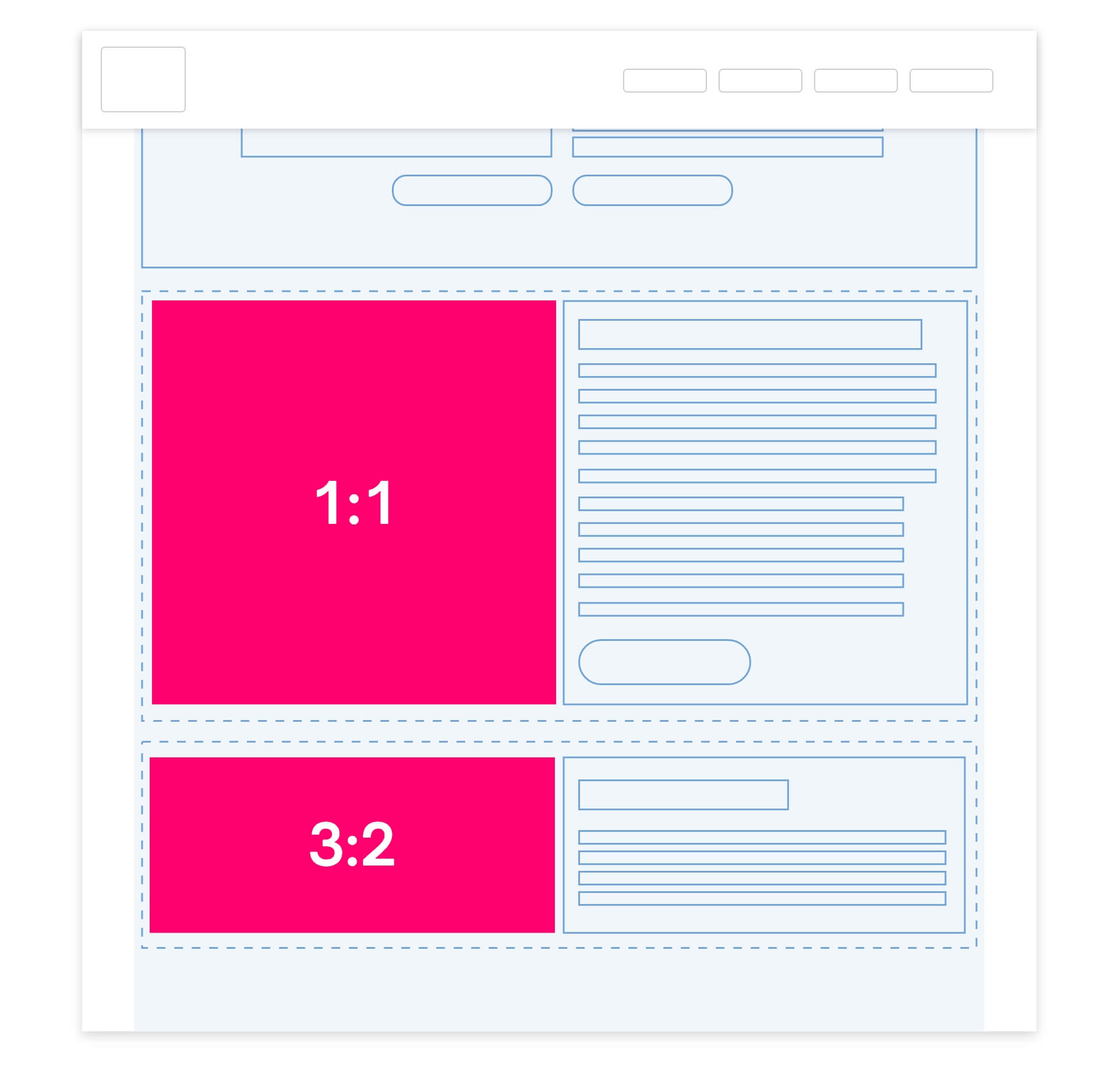
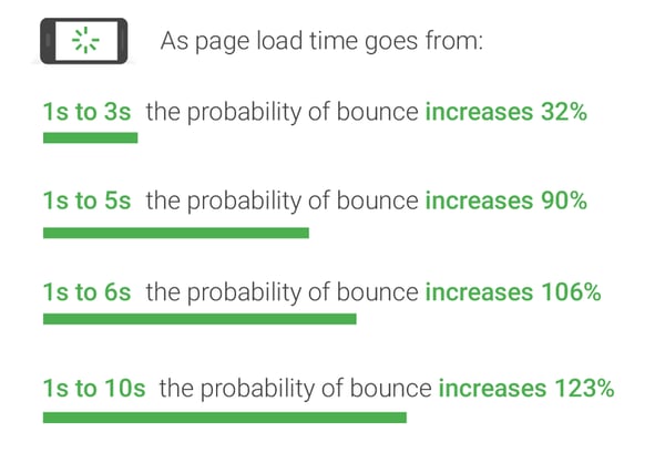
Image Size Impacts Page Load Time
Website page load times depend on a range of factors including web page design, the browser, your website host, the device you’re using and more.
The ideal web page load shouldn’t be more than two seconds in order to avoid losing potential customers, conversions or sales. You can learn more about improving page load time here, if you’re interested.
Page Load Time Impacts Bounce Rate
What Image File Type Should I Use? (PNG vs JPEG vs SVG vs WebP)
These are the most common file types for a website:
|
JPEG |
Highly recommended, and the best option for photographs or stock footage throughout your website. Lightest in file size, lossy file type - which means it will always lose information the more you edit the image. |
|
PNG |
Recommended for icons, flat-colored graphics, and logos because it supports transparencies but it has larger file sizes. |
|
TIFF |
Tagged image file format; These are lossless file types, will allow for higher quality but they have large file sizes. Best for prints and publications, not websites. |
|
GIF |
GIF allows for transparency, can be animated and is usually very small in file size. You can also use it to quickly animate a logo, a product you're selling or a graphic on your website. |
|
SVG |
Aka “Scalable vector graphics”; Some website builders like Wix allow uploads of SVG file formats which then allow you to make edits in the website editor to the colors within that graphic. This file format remains clear at any size because it’s drawn mathematically with open-sourced software. They tend to have larger file sizes, can be animated, support transparency, and are a lossless file format. |
|
WebP |
WebP is a newer image format that provides superior lossless and lossy compression for images on the web. Use WebP to create smaller, richer images that can help your website pages load faster. WebP lossless images are 26% smaller in size compared to PNGs. |
Image Names & Alt Tags
Image File Naming
Choosing the right file name for those images can also help your page's SEO ranking in image search results. Be sure to name the files with relevant and descriptive keywords, and don’t use underscores. For example:
Instead of:
drinkingcoffee.jpg
drinking_coffee_2.jpg
Use descriptive keywords:
woman-drinking-coffee-near-desk.jpg
Using Image Alt Tags
Good alt tags help all the hard-working web crawlers to figure out what your images are about while they further index your site. They are also used by screen readers to describe the image to visually impaired users. Providing alt tags gives good context to the web crawlers, helps visually impaired users, and helps your web page ranking as well. Image alt tags should describe the image without stuffing keywords. Think how you would describe the image to someone who can’t see it.
Video & GIF Sizes
Using Animated .gifs
GIFs afford transparencies and animation but their cost comes at the file size. Having a 1500px wide gif wouldn’t be the best option for your site's loading page speed. It’s best to keep the file sizes at less than 1MB especially if you intend to use them as a background image for your hero section. You will want to have a high res video in your hero section as a smaller gif may be really pixelated if it’s forced to upscale in your browser.
Using Videos as Background
Videos in your hero section can be really appealing and they can help convey what your company or business project are all about. Background videos aren’t really meant to be viewed at 4K, and sometimes they’re overlaid with a certain color to either darken or lighten the background in order to provide contrast to the page header and subtitle.
Couple of things to keep in mind for background videos in hero sections:
- If your video is intended to be full screen on the home page we recommend that it be a 16:9 ratio.
- Aim for your background video to be between 5 - 20 seconds
- Keep the video file size to 6MB or less
- Keep the audio off. Videos that play audio automatically are ranked as one of the most annoying experiences a website can offer. Plus, adding audio will increase your file size so we suggest you just remove it if it’s not needed or have it muted by default when the page loads.
- Don’t let the video compete with the content on the page. Make sure there’s enough contrast between the text and image color that you can easily read the text. You can use color overlays to help provide contrast for an image that has both light and dark areas.
- Consider lazy loading videos below the fold of your website to allow the main content on the page to load more quickly.
Embedding vs Hosting Videos on Your Site
You may find that you want videos throughout your website to create a stronger online experience for your visitors. Should you embed or upload your videos to be hosted directly on your site?
Hosting Videos on Your Site
Uploading videos to your site can slow down the page load times which is why embedding them is preferred. Virtually every video hosting site allows creators access to an “embed video” link. It’s just a matter of what platform you are pulling the video from.
If you are uploading a video to use on your site, you should use an MP4 file with HD quality to ensure that it works on most browsers and looks great on most devices. When saving in your site files, give your videos descriptive titles that reflect what the video is about to help boost your SEO.
Embedding Videos on Your Site
A couple of things to note with embedding videos on your website:
- Embedded videos are a good way to avoid file size and storage limits from your host provider.
- Embedded videos grant you room for higher streaming quality.
- Embedded videos also allow for faster page loading times.
- Embedding videos also allows views from your site to count towards views on a platform like YouTube or Vimeo, increasing your SEO value.
If you are auto-playing videos when the page loads, ensure the sound is muted. Unless the video is a key element of the page, it is recommended that you do not enable auto-play.
- Show the video controls giving user the control to engage with the content
- If the video is landscape, export the video at a 16:9 aspect ratio (panoramic, landscape view)
- If the video is meant to be vertical (suitable for Instagram stories or TikTok) an aspect ratio of 9:16 is recommended.
Color Profiles
There are lots out there, but the most recommended for our purposes are sRGB. This is because sRGB is the standard for digital images, the internet and your house printer. Using the sRGB color profile ensures that your colors won’t look washed out, dull or oversaturated on different devices, programs and applications.
Other Image Considerations
Before You Upload... Compress!
No matter where you get the image we encourage you to use TinyPNG, Optimizilla, or the free version of Kraken to reduce the file size of your JPGS and PNGS. These sites reduce the file size but have very little to no visible effect on the quality of your images. For most images, you should aim to compress your image under 100 KB, or under 200 KB for full-width images.
Image Resolution
It matters most when printing an image. The resolution value will determine the number of pixels from your image that will print per linear inch of paper which is why printed work for deliverables like brochures or artwork on a book, should be at 300 ppi or whatever your printer asks you for.
Because we’re displaying the images on the web, image resolution doesn’t matter as much if you were to print the images. If you really want a number though, we’d say use 72 ppi dpi (dots per inch). If you're curious to learn more about Image resolution head over to photoshopessentials.com for a more in depth view of image resolution and a little bit about the 72 ppi myth. Below are some images with different resolutions but the exact same file size and pixel size.
Pixel Size vs File Size
Pixels make up the image file size. The less pixels there are, the less information you have about an image and the smaller it will be. Take a look at this image of a Phone below, the images range from 262 to 1192 pixels in width. Side by side, in small versions, they look very similar. However, if you begin to zoom in you’ll quickly lose the sharpness whereas the image on the right remains sharp due to having more pixels.
Following Standards vs. Breaking the Mold
This guide on website images is intended to help you answer all those questions that pop up during the design and maintenance of your website. However, the 'rules' of design, UX and SEO are fluid and changing and this guide is not the last word on what you should do with your design. Some of the best sites we've seen intentionally and conscientiously break these rules and the result is amazing.
Not sure what to do with your website? Our award-winning website designers can help you out.
Other posts you may be interested in

How to Use the HubSpot AEO Tools to Grow Your Visibility in AI Search
.png)
Is SEO Dead? Organic Growth in the Age of Zero-Click and AI Overviews

27 Biggest E-Commerce Mistakes (and How to Fix Them)

.png)
.png)
.png)