Published: 20 May, 2023
- Share
-

-

-

What size should my hero be?
While there is no magic number to hero sizing there are some common guidelines that you should follow when identifying what size and ratio your hero images need to be.
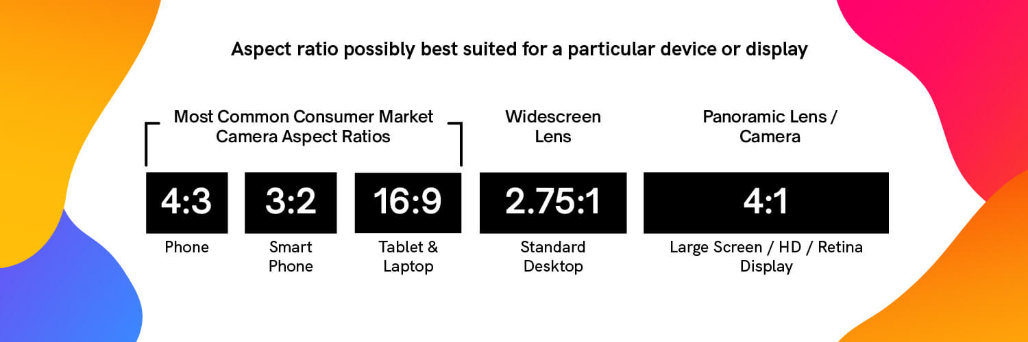
Hero Image Ratios for Mobile, Tablet & Desktop
If your website is responsive, your hero image will resize to fit large or small screens. Depending on how your site was built, it may also resize the aspect ratio.
Here are the most common aspect ratios for mobile, tablet, desktop and large scree/HD/retina displays.
How Many Pixels Wide Should a Hero Image be?
According to StatCounter, the most common desktop browser resolution sizes in North America are*:
- 1920 x 1080: 19.85%
- 1366 x 768: 14.33%
- 1536 x 864: 9.44%
- 1280 x 720: 6.52%
- 1440 x 900: 5.92%
- 1600 x 900: 2.27%
This does not include mobile browsers, which are obviously going to be smaller.
Typically, the largest and most common screen size your readers will use is 1920 pixels in width. You generally don’t need more than 2000 pixel-wide images unless you've noticed in your Google Analytics that your audience has a high volume of visitors on extra-large devices. Depending on your site and your audience, you may be surprised to learn that the majority of people are looking at your site on very small screens.
For desktop users, the minimum resolution on the most common browser resolutions is 1280 pixels. You should make sure that your hero image is at least 1600 pixels your hero images look great for most desktop users.
*April 2022- May 2023 data
Resizing Hero Images for Mobile
If your website is responsive your hero image dimensions will adjust to fit the device.
If you want to maintain more control over the size and ratio of the images you can specify that your site show different images depending on if the visitor is on desktop or on a mobile device.
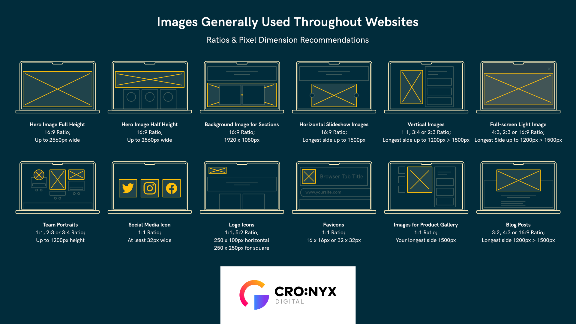
Need more image sizing guidance? Check out our 2023 Image Sizing Guide!
Other posts you may be interested in

How a Multi-National Company Took Month-End Invoicing Off the Calendar

How to Use the HubSpot AEO Tools to Grow Your Visibility in AI Search

How Financial Services Teams Can Use HubSpot Without Compromising Compliance

.png)
.png)
.png)