Published: 22 July, 2021
- Share
-

-

-

You have spent months determining your business KPIs. And once you have finally selected them, you thought all your troubles were over.
But now you have another problem. You don’t know how to visualize those KPIs effectively and you are stuck with a confusing mix of charts, bar graphs and pipelines.
So, what should you do?
It takes trial and error to realize that a good KPI dashboard relies on simplicity. So basically, what you should aim for is to visualize relevant and reliable data that’s easy to understand and preferably located all in one place.
Sounds impossible?
Well, we thought so too, but now we know you can create wonders with the right tools.
This short guide will show you how to gather your business KPIs effectively and create a user-friendly KPI dashboard to track your performance with ease.
Opt for Data Visualization Tools
The three most common ways to create dashboards are:
- Spreadsheets
- Presentations
- Data visualization tools
Spreadsheets and presentations can serve as first aid if you don’t have a more advanced tool available, but they have quite a few shortcomings. The most significant one is that you automatically update and track your data in real-time. You need to do it manually every time you need to report on your findings.
On the other hand, data visualization tools help you track your website or business performance in (near) real-time and give you a straightforward overview of what’s currently going on so you can react timely in case you notice an issue. Another benefit of using such a KPI dashboard is that it’s a collaborative tool - you can allow access for everyone on your team so you can work together and save time.
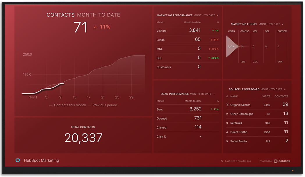
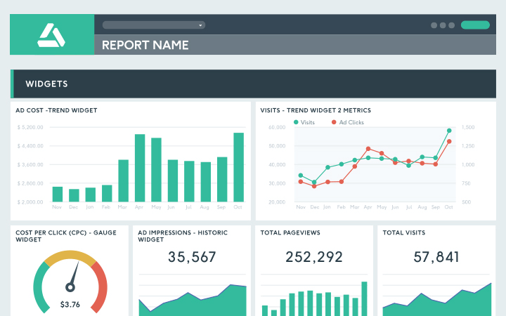
Data visualization tools typically support integrations for different sales, marketing, analytics, and other tools, so you can truly keep all your KPIs in one place and create more efficient and relevant reports. They may also offer templates, so you don’t have to spend time on building a dashboard from scratch, but choose the best from Google Analytics, HubSpot, Salesforce, and other tools.
Include Only the Relevant KPIs
When you choose an uncomplicated way to visualize your data, it’s time to decide what you’re going to include in your dashboard. Have you already defined your business KPIs?
To track the chosen metrics more easily, avoid going overboard with the number of KPIs - only use a selection of most relevant KPIs for each dashboard you’re planning to create. Too many KPIs may cause chaos and make you lose relevant information in the analysis. It’s better to create separate dashboards for different aspects of your business than to try and stuff a single dashboard with a bunch of KPIs you’ll no longer be able to track.
Don’t forget that a good dashboard doesn’t go too much into detail. It’s designed to provide you with a concise overview of what’s going on so you can notice patterns, red flags, or positive trends more easily.
Keep the dashboard design simple. The whole point is for it to be easy to navigate, not to be fancy or impressive. Its functionality is the key, and everyone on your team should be able to read the data properly.
Painless Data Analysis
If you trace back your business growth, you’ll see it all comes down to measuring your performance and acting according to the results you get.
To create valuable reports, whether you’re in marketing, sales, or another department, it’s critical to have a clear and easy-to-use KPI dashboard that includes only your most relevant business or website KPIs.
That way, you’ll save your time and energy when pulling and analyzing the data, which allows you to create actionable plans more quickly and tackle even the smallest issues in your performance in a timely manner, achieving better results in no time.
Use the Right Reporting Tool
Google Data Studio, DataBox and DashThis are some of our most commonly used dashboard reporting tools. Contact us to see which one is right for your reporting needs.

Other posts you may be interested in
.png)
Is SEO Dead? Organic Growth in the Age of Zero-Click and AI Overviews

27 Biggest E-Commerce Mistakes (and How to Fix Them)

A Great SEO Team Needs Developer Support

.png)
.png)