
Published: 30 October, 2021
- Share
-

-

-

Whether you’re presenting your reports to a team or sending them via a link, your dashboards need to be clear and communicate their data story on their own. Here are our tips to build a better dashboard.
Don’t Settle for Just One Dashboard
First things first. You should not be looking to add ALL your reports to one dashboard. It’s too overwhelming. Instead, break out your reports into different dashboards based on your audience, your department, the type tasks you’re reporting on, or another meaningful segment.
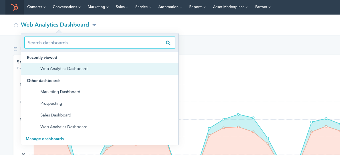
Depending on your business there may be several different dashboards required to keep an eye on performance such as:
- Executive Overview: High level business metrics to track business health.
- Marketing Overview: High level view of the trends and impacts of different marketing activities.
- Email Marketing Dashboard: A look at important metrics tied to email marketing specifically.
- Sales Rep Report: A look at the activities and goal tracking of one individual sales rep.
- To name just a few.
Consider Your Audience
People love a good stat but they HATE long tables of data that’s not relevant to them. Think about who your audience is for your reports and what data is going to mean the most to them. If you’re a Marketing Manager it may be tempting to pull a report that shows everything you’ve been working on but your boss is probably more interested in the impact of that work: the results.
Identify Your Goals Before Selecting Your Reports
I think we’ve all been in a meeting where someone gets fixated on a report or metric that derails the conversations and distracts from the actual goal. As the dashboard creator, it’s your job to prevent this.
I’ve seen many website report dashboards that include EVERYTHING you can think of. Visits, unique visits, pageviews, pageviews per person, top pages, top landing pages, top organic landing pages, top blog pages, top pages by CTA clicks, top pages by conversions, top pages by bounce rate, overall bounce rate, bounce rate by source, I think you get the picture. These are all great stats but they can’t all be equally important to you and especially not for your dashboard.
What are the most important things you’re trying to achieve? Report on those.
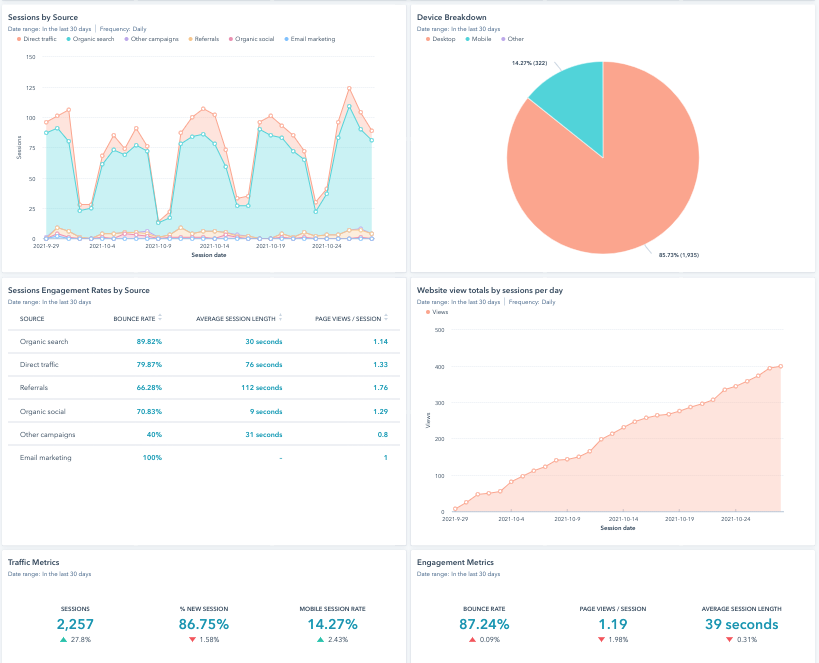
Use Visuals
TL;DR: No one reads. Use visual data that tells the data story like a picture book.
This example below is just a marketing image from Databox but you are likely already a bit interested when you see the data presented in a comparative column chart, a funnel flow, a dial and some table data to fill in the gaps. Different types of visuals will actively engage your reader and keep them excited to see what’s next.
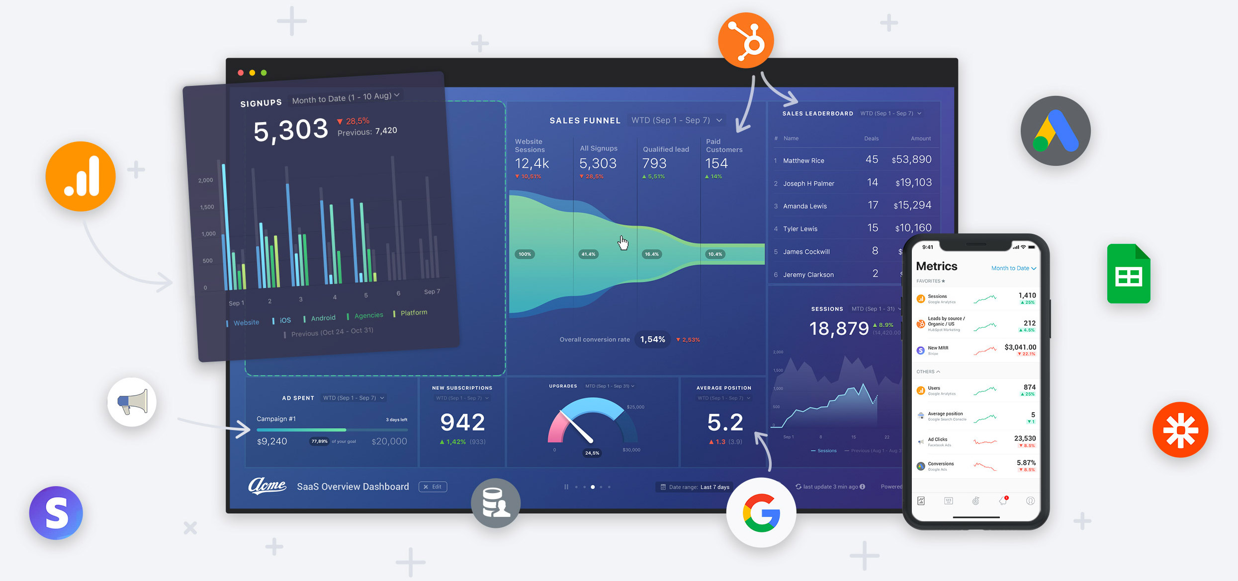
I’ve included this image, even though it’s not a real dashboard, because it has another great example of using visuals. All those little icons make it crystal clear as to which data sources these reports are coming from and what you can connect with their platform. Take this hint from Databox: use visual cues instead of relying on words.
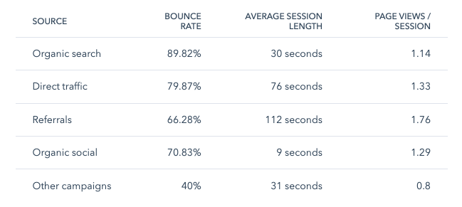
Use Tables
Visualizing your data is great but some data is just easier to compare in a table. Don’t be afraid to put a simple table into your report.
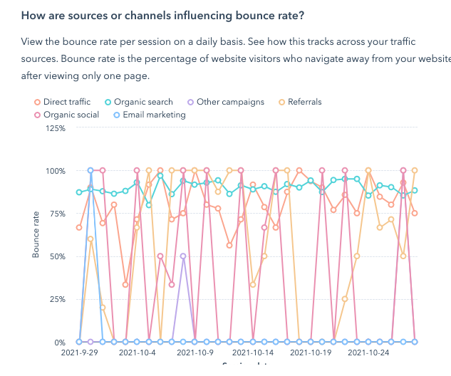
Play Around with Chart Type Until You Get it Right
Some data just won’t look right or be easy to understand in some charts. Like this line chart on the bounce rate of different channels below. Showing data like this on a daily basis is unnecessarily complicated and makes this report useless.
Remove Inaccurate Data
Data not collecting? Changes to your goals? Is it showing in your reports?
Here’s an example where there was a change in the website and the conversion process where the original source was stripped out of the visit as they completed the conversion. The conversions are still tracking but the visitor source of those conversions isn’t (most of the time). The result is that the last box showing “Organic Conversions” looks really, really bad.
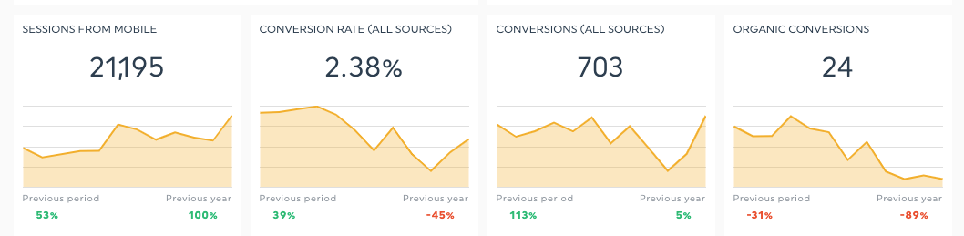
If you don’t take action to update these reports you will have to explain that “the conversions are there but we can’t track it back to the source and that’s why it looks like conversions are tanking” every. single. month.
Let me be clear that I am not suggesting that you should simply remove data that makes you look bad. If you have a problem with the data, fix the data and fix the report. Or, find a different way to report on the KPIs you are working towards.
Name Your Reports & Label Your Axis
While it’s really important to get your visualization type ‘right’ you also need to make sure that you are naming your reports and labeling them so that your stakeholders can easily understand what they’re looking at.
Consider this report for “Top Pages”...
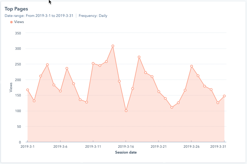
Looking at the title of “Top Pages” one would expect to see a list of which pages were the top pages. This report is actually a report of “Page Views of the Top 10 Pages of the Site” which is put in context next to a “Total Website Pageviews Report” to show how this particular website has just a handful of pages that are driving the majority of the page views.
Context matters and your chart labels are integral to creating that context.
Consider Color & Other Visual Cues
Check out these reports — they’re great! Look at all those increased conversions!
Did you have a hard time identifying that this was a “good” report and not a terrible report? We are so conditioned to see red = bad that if are using red in your report you’re going to send signals that things are not going well.
Green = Good.
Red = Bad.
Yellow / Orange = Warnings.
If you don’t want to adhere to the traditional stoplight color scheme, go entirely away from it and use your own branded colors and set hard rules as to which colors you are going to use to show increases and decreases, wins and losses, and keep it consistent.
Follow the 5 Second Rule
As mentioned in this article by Databox, “Follow the 5-second rule; you should be able to look at your dashboard and understand all the metrics presented in under five seconds. If you can’t, your dashboard has too many reports on it, or the reports you’ve added are too complex.”
Keep it simple and tell a visual story.
Use a Dashboard Tool
You’re likely reporting on data from multiple sources and need to pull them all together to show the best dashboards. We strongly recommend using a tool that pulls in your data so you can report on it all in one place.
Need help making your reporting & analytics awesome? Contact us!

Other posts you may be interested in
.png)
Is SEO Dead? Organic Growth in the Age of Zero-Click and AI Overviews

27 Biggest E-Commerce Mistakes (and How to Fix Them)

A Great SEO Team Needs Developer Support

.png)
.png)