
Published: 21 November, 2020
- Share
-

-

-

Ecommerce websites have stiff competition and ever-shrinking margins. If you want to stay competitive in the search results while providing a solid user experience that converts visitors, make sure you avoid these common ecommerce website mistakes.
Ecommerce Website Navigation
1. Search vs Category Browsing
People navigate content differently. Some people will land on a site and immediately go to the search bar to find what they’re looking for. Others will click from category to subcategory and page by page through a list of products until they find what they’re looking for. Others will use filters. And some will even let you guide the experience and merely follow your featured links, categories and products to discover new things.
Most users tend to start browsing over searching. Between 11% and 21% of users will start with search.
Research into visitor behavior by Measuring U found that most users enjoy a browsing experience and start their engagement with a website by ‘taking a look at the displays’ of their featured products and curated collections. Only 11-21% of visitors went straight to search to find what they were looking for.
What this means: Your home page and website templates need to showcase products and collections to your visitors in a way that lets them continue to wander the aisles of your store. Identify and reduce ‘dead ends’ by showing ‘people also viewed’ type content that is likely to be interesting to them.
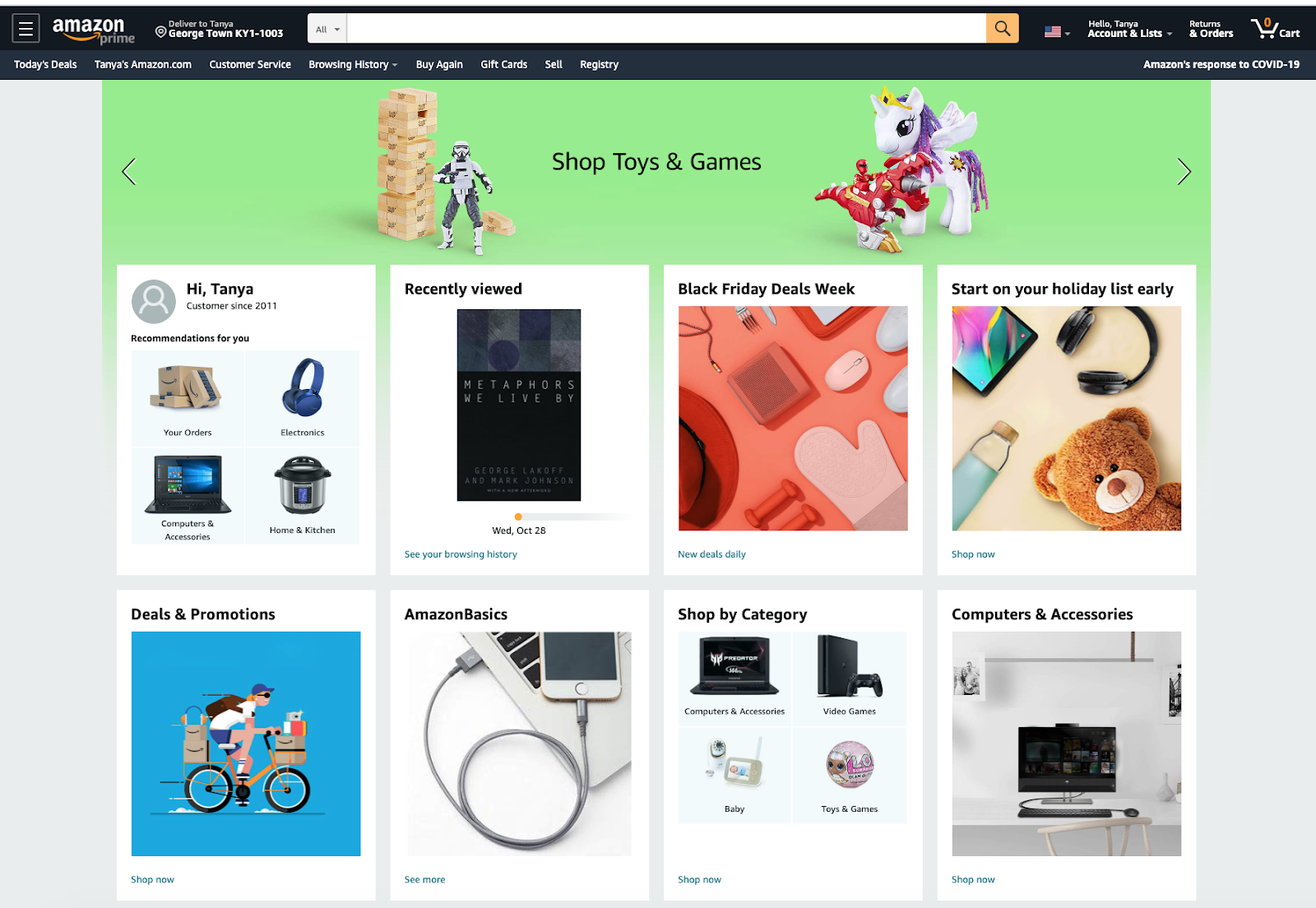
Amazon does a great job of this and focuses primarily on category browsing and personalized products throughout their UX.
2. Breadcrumbs for When You Get Lost
Ideally, your visitor is going to find themselves lost in an aisle that is filled with all their favorite things (and they buy them all!). But sometimes they start down a path that leads them to a dead end. Give them the opportunity to back up just a bit, without having to start from the beginning, with a breadcrumb trail. It’s an easy navigation opportunity that is often missed.
Here’s another example of Amazon getting it right. This is a pretty long trail but gives the visitor lots of easy to reach sub-category options.
3. Search Analytics
It’s important to understand what people are searching for on your site for two main reasons:
- A high search volume for a certain product can indicate the lack of a clear browsable path.
- You can identify popular products to feature and capture more browsers.
By far, the most common mistake ecommerce websites make in regards to search analytics is not digging deep enough into products that returned no results.
When a search query returns no results:
- If you DO have the product – you may need to add different keyword variations and aliases to your search tool (“swimsuit” = “bathing suit” = “swim costume” = “togs”). Or you may need to update your product descriptions to include these keywords and unique identifiers.
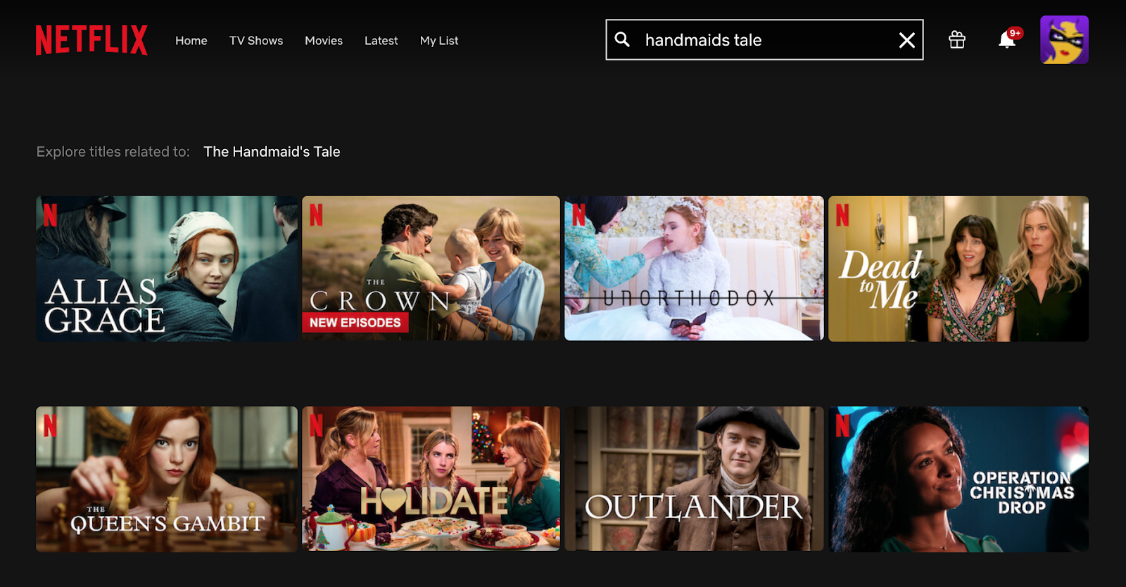
- If you DO NOT have the product – you may want to offer a different product or set of search results instead of your typical 404 page. Netflix really gets this right by featuring similar content to the searched keyword:
Ecommerce Website Content Mistakes
4. Manufacturer Provided Content
It's so easy to just use the default content provided by the manufacturer when you’re adding products to your site. But when your product descriptions are the same as the next site, you’re going to have a hell of a time outranking them. Especially when you have hundreds (or thousands) of other sites who have that same content.
Do yourself a favour and re-write that content to make it stand out. Use real-life language and set context to the product. Move beyond the features list and break down why those features are important. Add your own images. Add links to supporting content, especially if those links can be to your other products and content.

5. No Content
The only thing worse than canned content is NO CONTENT 😱. Your products will not sell if there is no product description associated with them.
6. Conflicting Content
I shop online a lot and this is one thing that has caused me to not order products – and abandon entire orders: conflicting content. Product titles and descriptions that don’t match. Images that don’t match the product. Shipping costs and times that seem to change. Anything that raises a “wait, is that right?” flag will call your entire site's trustworthiness into question.
7. Multiple H1 Heading Tags
HAVING MULTIPLE H1 HEADING TAGS ON A PAGE IS TO GOOGLE WHAT TYPING IN ALL CAPS IS TO YOUR READER: ANNOYING AND CONFUSING. IF EVERYTHING IS SUPER IMPORTANT NOTHING STANDS OUT AS BEING THE MOST IMPORTANT.
Your category pages should have one H1 tag: the name of the category.
Your product pages should have one H1 tag: the name of that product.
Other headings should be subheadings and tagged accordingly.
8. No Long-Form Content
Articles, blog posts, buying guides, comparisons, etc. all make for excellent content that helps to improve SEO and helps visitors make informed purchase decisions. If you’re not using it yet, it’s time.
9. AMP Markup for Blogs & Articles
Google loves to show fast-loading pages and AMP pages are fast-loading pages. Get AMP on your blog and your article posts so your content can have a competitive advantage.
Mismanagement of Old Product Pages
10. Self Cannibalization
That new product model that’s very similar to the last one and the one prior to that may have very similar product pages. Leaving all of these pages up and having version upon version indexed and ranking leaves you competing against yourself. And you end up diluting your potential search presence for any of the short tail keywords related to this product line. Think of the iPhone 12 competing with the iPhone X, iPhone 8, iPhone 7, and ALL the different variations of these pages that Apple wants to show for when someone searches for “buy iPhone”. If you have a ‘multiple pages of the (almost) same product’ scenario going on you need to create a solid strategy to manage these.
11. Lonely Orphan Pages Everywhere
Taking your products ‘down’ from the category and product listing pages helps to keep your site looking nice and tidy for website visitors. However, if these pages are still live but have no real navigation to them, they still exist as ‘orphan’ pages that just live all by themselves, lonely and sad on your servers. You’ve totally forgotten about them and haven’t been updating their content, their templates or anything else on them. The only people who see these pages are people who have clicked on an old link to this page from another site or who find them in the search results.
When someone comes to your site for the first time and they land on one of those old, outdated, unavailable product pages, they’re not getting a good taste of what you have to offer. It’s not a solid user experience and likely won’t drive any sales. You need to rethink your discontinued product strategy.
12. 404 Pages Everywhere
Deleting your product pages so people don’t come across old products is an even bigger mistake for some websites. If no redirects are put in place, people who have clicked on an old link to this page from another site or who find them in the search results are going to get your 404 page! Page not found! 😱 They’ll hit the back button and return from whence they came before you can show them a related product. You need to rethink your discontinued product strategy.
Poor Use of Unoptimized Images
13. Not Enough Images
One of the big blockers of online purchases is the “I just need to see it in person” objection. People want to know what the product really looks like, feels like, how big it is, etc. before they order. When you're dealing with ecommerce marketing you need to give MORE information to help build trust in the purchase.
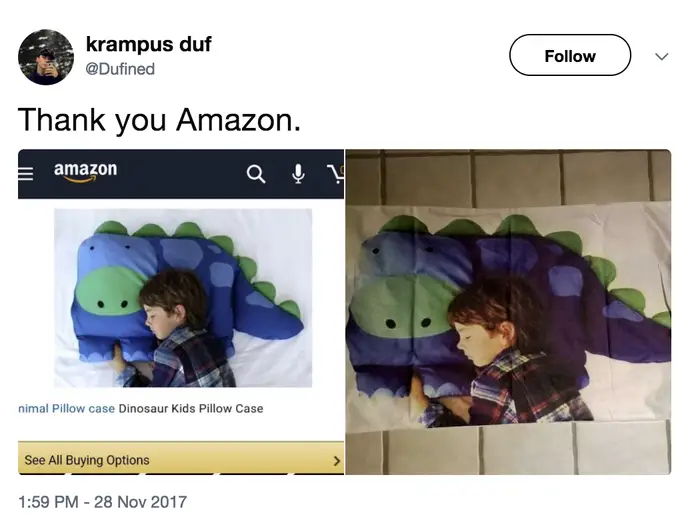
Nobody wants to receive their order and realize that the images may have been a touch misleading. Like these guys 👇🤦♀️.
14. Image Alt Tags
When you do have your diverse and “in real life” photos added to the site you’ll want to ensure they all have alt tags. This is a huge missed opportunity for ecommerce sites. This generally happens when you import a large batch of products and don't optimize the images afterwards. Yep, it’s pretty tedious to add alt tags to every single product image on your site but it will greatly help you in the image search and organic rankings of your product pages.
Leaving Questions Unanswered (Not Enough FAQs)
15. Product Questions
When people are asking you questions about your products it could be a key indicator to you that you need to update your product descriptions. Questions like “is this compatible with…”, “what’s the shipping weight” and “what’s in the box” are all questions that should be answered on the product page to help inform your customers and help improve your content quality.
16. Shopping, Shipping & Company Questions
You need to have clear FAQs on your site for ordering and shipping questions. People will ALWAYS have questions on these and it’s expected that you provide clarity on them. Not laying out your process adds in that layer of uncertainty and can cost you a sale.
17. FAQ Schema
Don’t forget to mark up your FAQs with FAQ schema!
Detailed Reviews
18. Honest User Generated Content
If you’re not allowing and encouraging your customers to leave reviews on the products they’ve purchased, you’re missing out on a great opportunity to have user generated content that talks about your products using unique keywords and phrases. You’re also missing out on giving future customers a way to feel more confident in their purchase.
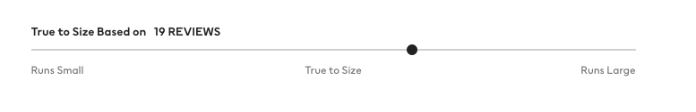
Depending on what you’re selling, try to go beyond the “5 star” system and get more specific feedback. H&M does it well with their “true to size” reviews that allows customers to give feedback on the sizing of each piece.
Restricting Website Access
19. Blocking Traffic IPs
You may not ship around the world and you may not want to encourage those who cannot purchase your products to use your site. But that doesn’t mean you should lock them out entirely.
Here’s an example: I’m a Canadian living abroad and I still have loads of friends and family in Canada. I needed to purchase a washer & dryer in Canada, with a Canadian credit card, for delivery in Canada. I headed over to Home Depot to check out their major appliances:
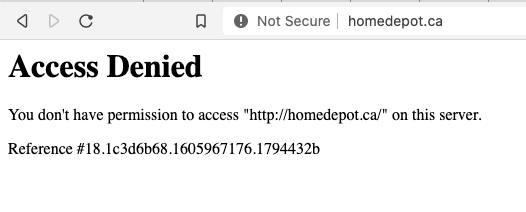
This is a prime case of completely missing an opportunity for sales.
Instead of locking people out entirely, consider how you can service them. Here’s how their competitor Rona handles my visit to their site:
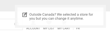
Rona’s letting me know that I’m not currently in Canada and is also letting me know that they’ve selected a store for me which will change pricing and delivery options. They’ve made it clear in their shipping FAQs where they ship to and different ordering options.
URL Structure
20. URL Strings & Parameters
If your site is generating product URLs that are just a string of product ID numbers, you’re missing out. Optimised URL strings that include the product name will create a better user experience, make your links more sharable and clickable, and could add to the SEO value of that URL.
21. Broken Links & Redirects
Circling back on those discontinued products… you’ll want to make sure you’re regularly checking your internal links to identify any broken links and broken redirects. This commonly happens when you’re adding, removing, and changing the names of products. Not maintaining your internal links creates a poor user experience and is a huge missed opportunity for building a strong internal link architecture.
22. Lengthy Redirect Chains
If your archived product strategy involves redirecting the old product page to a new page, that's a great strategy. But when that page becomes replaced with a new product and you add in a new redirect, you start building redirect chains.
It can be difficult to remember all the legacy redirects that you’ve put in for old pages so I recommended that you keep a list of all your redirects. This will allow you to easily search and update them regularly. If you haven’t been keeping track, you can use a site crawler like ahrefs or Screaming Frog to identify your 301s and redirect chains so you can document everything then clean it up.
Lengthy & Complicated Checkout
23. Multi-Step Checkout
Checkout processes with lots of steps, that collect too much information, or require you to create accounts before you even get the info you need to make the purchase (prime example: no shipping info until you enter your billing info) will discourage people from making the purchase. At this point in the process, it would be a shame to lose that sale that’s so close to being completed!
24. Multi-Device Checkout
Dominoes gets a lot of love for their one-click (and zero-click) checkout process. What you may have missed is their multi-device checkout options that allow you to order pizza on your Xbox. Many retailers are simply not paying attention to their audience to identify other platforms that could be leveraged for ordering capabilities.
Set It & Forget It
25. Not Enough Testing
What tests are you running to improve user experience and increase conversions? Probably not enough.
It’s a huge mistake to not test at least a few elements all the time. Here are some things you can test:
- Test the categories and products that you’re featuring
- Test different product page layouts
- Test a different checkout experience
- Test a different layout for your search results page
- Test changing up the “Buy Now” or “Add to Cart” button – what happens if you change the colour, the text, or the placement of that button.
- Are you leveraging abandoned cart ads and emails? Change those messages and see what happens.
The list is endless but if you’re not running any testing, you’re not working to improve the status quo.
Social Isolation
26. Missing Social Sharing Opportunities
Allowing your visitors to share the products they come across is a missed opportunity to increase your audience reach. Integrating social sharing options to each and every product allows your visitor to share that product on the platform of their choice. Depending on your particular industry, Pinterest is a social media traffic goldmine for retailers with these pins featuring prominently in Google Image Search. Instagram is also VERY popular right now and gives a lot of audience potential.
Remarketing Too Much (or Not Enough)
When someone comes to your site and browses your products, they’re clearly interested in some capacity. Remarketing and showing them the products they looked at (perhaps with an additional discount) is a very cost effective way to get them back to finish that purchase.
27. Frequency Capping
Remarketing is great but relentlessly remarketing to someone will eventually just make them annoyed and frustrated. You can set daily, weekly, or monthly caps. These can be set at the campaign level, so if you have multiple campaigns running remarketing, you need to factor those in to how often someone is going to see your ads. Check your Google Ads Reach & Frequency report to see how often people are seeing your ads and make adjustments as necessary.
28. Excluding Converted Customers
A quick win for common remarketing mistakes is to generate an exclusion list for recent conversions. Once someone purchases your products you can reasonably stop remarketing those products to them.
29. Not Leveraging Abandoned Cart Emails
Abandoned cart emails are a great way to seal the deal with those visitors who didn't follow through. Some of those visitors will not have converted for a reason – use these abandoned cart emails to give those visitors an opportunity to ask for help ("Have questions about this product, ordering or shipping? Contact us") or to impose urgency ("10% off today only!") to help nudge them towards placing the order.
Doing It All Yourself
Trying to wear too many hats or bringing everything in-house can lead to missed opportunities simply due to not having enough time to do it all, or the right expertise for specific campaigns. Working with an ecommerce marketing agency who knows the ins-and-outs of online marketing campaigns for retailers can help you supercharge your online presence and online sales.

Other posts you may be interested in
Improve The Quality Of Your Google Analytics Data with Filters & Exclusions

Building an Inbound Marketing Strategy

HubSpot Campaign Reports: How to Track Non-HubSpot Assets

.png)
.png)